Feed Back from the industry.

7 07 2009

Recently I spoke to Ben Sizer, Software Engineer at Nottingham Based Monumental Games. As a programmer Ben works with the practical side of games, and is familiar with how art is applied in practical terms when creating a game.

I showed him the trailer for the pigeon king and asked for his feedback in terms of how he saw it practically and artisitcally.  I was really happy with how comprehensive Bens feedback was:

“- coherent art direction that supports the setting without compromising the chosen distinctive aesthetic.

– very detailed backgrounds; may be resource intensive, but this might not be a problem if there is to be no change in the camera distance or angle. use of period art and recognisable landmarks help to communicate the setting to the player without requiring textual exposition.

– trailer shows several scenario examples, providing an insight into the sort of colour schemes and textures needed throughout the project. Ideally more would be provided so that estimates could be made of the total asset requirements but what is shown is sufficient to gain a good understanding of the sort of art ‘density’ and the programming requirements to rendering it.

– the animation could be smoother, but presumably that would detract from the desired effect? There’s nothing wrong with the style as long as it is presented consistently – perhaps in a way it is too good in places?

– very effective use of depth of field effects on top of the parallax scrolling to add a 3rd dimension to the otherwise 2 dimensional medium. The blurred foregrounds may take work to get looking good in a final hardware-accelerated implementation due to the alpha blending at the edges but are definitely practical.

– for the most part, background texturing is good and not too saturated, so as to not clash with gameplay elements or foreground characters. In some places background elements may be too bright or saturated and draw the eye more than the moving characters, but it’s nothing that a mild adjustment wouldn’t fix.

– explosions and fires look good, but would need careful implementation, maybe replacement with particle effects to meet real-time performance and resource limits.

– lighting is tasteful – most of it, including the bloom effects, can be burned into the backgrounds, with little requirement for dynamic lighting.

– characters feel coherent, with similar figures and distinctive detail in each case. Character style is consistent with environmental style.

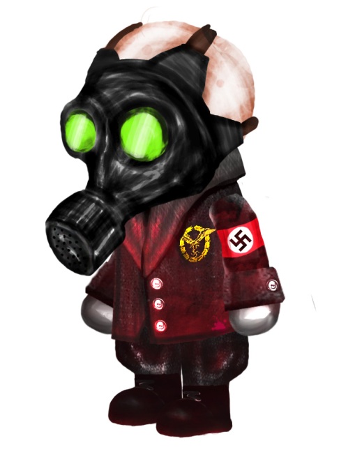
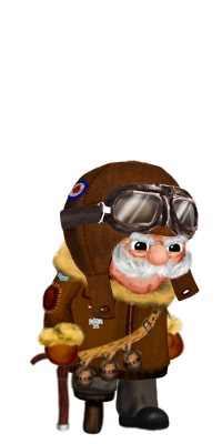
– character silhouettes perhaps not as distinctive as they could be (compare with, eg. Sam Fisher’s 3 goggle lights, Mario’s red hat) which may be slightly confusing in slow-moving scenes with distinctive background features. Characters are not lacking these features (eg. pipe, moustache, flying goggles, gas-mask on the presumed adversary) so perhaps they can be brought more to the forefront.”


All Art Work Finished.

7 07 2009

Ok, so it’s been stupidly long since I updated on here, but admittedly, I’ve had my head down and I’ve been working. As of now, all of the Animations/Menu’s/Character designs and Prints are finished.

I’m going to reflect on the finished pieces in this very long article!

1. The London Rooftops Video.

This video was the hardest to do, It’s the one I “cut my teeth” on and it threw up the most “learning experiences” (read: mistakes) Due to the number of layers and frame rates I was working with, I had serious problems even getting After effects to preview it, let alone render the finished thing. The solution in the end was to sacrifice some depth in the background, merging multiple layers. Comparing the before and after you can hardly tell any difference. The video is also of quite a slow pace, but with some key moments of excitement mixed in. This was originally intentional, as this is intended to be an early level in the game, where the player would still be learning the ropes. However – on reflection, it is perhaps too slow, and could of been more exciting. Time restrains prevented me from redoing this though – and all told the video is still more than satisfactory and I am very happy with it.

2. Factory Escape Video / Artwork

Set at a much faster pace than the other 2 videos, this one required management of many events and effects in a shorter period of time. Perhaps the biggest challenge in this video was the movement of Cooper and the Pigeon carrying him. This is a player controlled action and, as such, must appear to flow in a natural way, the player would react to objects and obstacles quickly and intuitively. Movements could most certainly not be roboticor appear scripted and forced.

I managed this by liberal use of the bezier movement tool in After effects, tweening objects between 2 points and changing the “curve” and the speed of the path that movement follows.

I think in the final video I’ve done a reasonable job of making it appear that a player is guiding Cooper, not that he is on a set demo path (which is in fact the reality)

Artwork: creating the artwork for the factory was a real test.  As the second piece of level art, it had to stylistically and thematically match the first. But it also had to be uniquely recognisable as it’s own location. This meant realsing what made the London level stand out.

– A liberal use of outlines on all elements, windows, boxes, girders – etc
– Seemless dark brick textures.

These things gave the factory a link to the london rooftops, however.  This leve is set much further into the narrative at a much more progressed and difficult time. There is more destruction, and more chaos.

I’ve also tied  destroyed brickwork and lots of fire together with the existing backdrop work from before to link the two in terms of location.

3. Boss encounter.

This video went much smoother with the existing 2 under my belt – I knew how to make after effects work efficiently at this point. That said, i was faced with the challenge of scripted set events. Like a “cut-scene” this depicts part of the game that has parts that will always play out the same. This is because it heavily features characters that the player does not control, the Nazi zombies, and the Main Antagonist.

I’ve achieved this by initially seperating the 2 parties, (Cooper/pigeons & Antagonist/Zombies) with separate entrances to the location, implying that one is hot on the tails of the other. The use of a frozen camera at the end suggests a non user controlled set of actions, as the camera is not following the protagonist.

Art: The art for this was much much harder to define, at first I attempted to create something similar to the interior of St. Pauls Catherdral. However, this building is too light, to spacious for the atmosphere of the occult I wanted to project. The church needed to break the real world ties of the game and take a more design sympathetic route.  To this end i’ve created an interior by hand that echoes the gothic nature of the church one imagines when they think of the dark ages. Filled with candles and cold black/blue bricks. This level now provides the perfect backdrop for the explosions of green projected from the antagonist in action.

4. Improvements to the pigeons:

Looking at real animations and studies of flight, It became obvious that I would have to animate a full wing flap in order to achieve the correct appearance of flight. Fortunately the Puppect tool in after effects allowed me to do this with a comparative ease and more than satisfactory result – given the alternative of hand drawing each frame of the flap (something I doubt I could of done with much clarity)

This first required some visual changes to the pigeons, which until now had looked a bit too dopey and rigid to be real birds. I had too closely stuck to the ideal of a pigeon, that of the stupid, disease ridden “vermin” not the reality, that they are actually pretty strong flyers and are not as physically “dopey” as the stereotype may purvey.

5. Creating Different zombies. The different locations require different zombies, after all, the people of  London do not all look the same. However to have a theme of enemies per level is something of a video game staple,  so I’ve stuck to Zombie “teams” per area. Really, this was just a case of “re skinning” my photo shop files. Because After effects reads the layers of a PSD it is possible to copy the psd, edit all the layers in place (i.e. add different clothes, colours etc) and then reimport onto the existing animation. You then need to tweak it all to ensure it fits, but it’s still an efficient and effective way of using existing resources and creating “new”  animations and characters from them.

The vidoes will all shortly be viewable on my youtube channel.  http://www.youtube.com/user/xerowalsh


Pigeon King gameplay render.

5 06 2009

A few issues with this:

– It’s far too dark
– I can’t get it to render in HD
– There is too much going on with the background maybe – It could afford to be simpler I think.
– Nothing seems to stand out enough. It’s kind of all a brown blur.


Level Art: london.

4 06 2009

London

(You’ll have to click the image to see the whole thing. )

There’s quite a lot of change since last time I’ve shown it. I’ve created and used repeating textures to make the building brick work,  I’ve scoured the national archives site for old war posters, which I think really dates the buildings well.

It took some time finding suitable fonts for the old storefronts on the right of the image,


The antagonist/villain/whatever you call him.

4 06 2009

baddie

Given what i’ve been learning about the design of a typical arch nemesis, I’ve tried here to counter cooper quite well.

Where this guy is strong and young – Cooper is old and weak.
Lufftwaffe – RAF

etc

However, I’ve tried to throw in a little something else – this guy is a little bit psychotic, unstable. He’s not really a calculated villian. Nothing like the typical “muwhahaha” type. There’s a bit more the the Dark Knights Joker to him, something chaotic.


Different strokes.

3 06 2009

I had a bit of a crisis of character design the other night. After finishing up the art work for the london roof tops level, when i first dropped cooper against the background I thought he blended in too much. I began frantically looking for a solution to this problem – I tried putting an oputline back on cooper (similar to early drawings of him).

coopersmalloutline

I really wasn’t very happy with the outcome, and it looks awfully generated (which it is).

On reflection, I think the issue may be more to do with choice of colour for the bg and coopers outfit, perhaps also cooper is too complicated in his torso section (seed bags, straps etc)


Character Design: Sackboy

3 06 2009

https://i0.wp.com/1.bp.blogspot.com/_HkOo-Ybu4Vw/SK3e217-TAI/AAAAAAAAAG4/7BlI13gADdA/s400/sackboy.jpg

Sackboy is the main, and kind of only character in Media Molecule’s Little Big Planet. I say this because every person who plays the game plays as a Sackboy or Sackgirl – the reason being for this is that little big panet is a game entirely about creating your own levels and worlds and your own experience in a very craft like fashion.

Sackboy is designed to promote and establish this asthetic. He is a basic character with plenty of original allure, constantly happy-as-larry and perfectly lovable as he is. That’s fine, that’s important and it helps the ID of the game as a whole.  Iconism isn’t really the drive with scakboy – personalisation is really the word here.  It’s often said by gamedesigners that they want the player to impart something of them self onto their lead characters during play with sackboy, that was the entire idea. Players arew encouraged to customise sackboy with colours textures, accessories, and costumes from other popular game franchises.

Sackboy is a celever piece of design, because he can be anyhting. He can be villianous, he can be heroic, he can be funky, gothic, cool, laidback he is a template for the style and preferences of the player.

https://i0.wp.com/cache.kotaku.com/assets/images/kotaku/2008/08/kratos_sackboy.jpg

http://pplibraryreviews.files.wordpress.com/2009/05/little-big-planet-sackboy-dragon.jpghttps://i0.wp.com/media.kotaku.com.au/mt/solid%20sackboy.jpghttps://i0.wp.com/media.giantbomb.com/uploads/0/4759/349414-sackboy4_super.jpghttps://i0.wp.com/cache.gawker.com/assets/images/kotaku/2009/02/sackboy2.jpg


Character Design : Henry Hatsworth and Weaslby the 3rd.

3 06 2009

https://i0.wp.com/www.destructoid.com/elephant/ul/110411-main.jpg

Henry Hatsworth is a character from the DS game “Henry Hatsworth in the puzzling adventure” The game is quite unique in that it is a platform adventure game where solving puzzles on the other DS screen grants powers to the player on the screen above:

https://i0.wp.com/www.deeko.com/news/wp-content/uploads/henryhatsworth_screen11.jpg
Henry Hatsworth (HH for now) is a British Adventurer with something of a colonial spirit to his appearance and style. He’s typicaly Adorned with khaki shirt and monacle, often weidling a cup of tea and an officers rapier – He’s also quite an old chap, which put’s him quite close to cooper in some ways; British and proud of it – but perhaps a little too old for all this adventuring.

The design of HH himself is quitesimilar to my favoured style of rendeirng, simple black outlines and subtle gradients and highlights in areas of soliud colour. Quite obviously hatsworth was rendered  in a slightly more controlled environment than photoshop, possibly illustrator or another vector program;

https://i0.wp.com/www.distantcreations.com/blog/wp-content/uploads/2009/03/hatsworth_normal.png

HH’s design is simple, and makes use of accent colours (red hat band + scarf) to create a character that scales well to the screen restrictions of the nintendo DS.

HH’s nemesis. – The appropriately named “Weasleby the 3rd” is his exact foil:

https://i0.wp.com/moonbooks.info/moonbooks/e107_images/newspost_images/839311-weasleby_the_third_large.jpg

  • Where HH is pragmatic, Weasleby is swave and exhuberant,  (Top hat / diamond cane)
  • Where HH ‘s lines are3 round and gentle, weaslby is sharp and pointy (nose, eyebrows)
  • Weaslby has the same attire as HH by type. Hat, Eyepiece, Cane, Neckerchief, jacket, shirt.

It is easy to see the structure of a typical Archnemsis/Villain at play here. All the qualities of the Hero’s ppaerance are shared by his foil but they are taken to the other end of the spectrum. The hero is not concerned for luxury, he just gets the job done with khaki’s and browns,  the Villian however is all suedes and silks and golds.


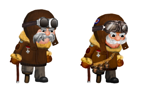
Cooper improvements.

30 04 2009

Following fdeedback from PGD presentations and some problems I have noticed myself. I’ve made some additions and cange to how cooper looks. I think the results are a marked improvment and have brought out his character more.

comparison

the above limage is an animated png. firefox 3 users should be able to see it move , other browser users may not. If you’re not using firefox 3. Why not?!

cp_walk


The Dishwasher: Dead Samurai.

21 03 2009

The Dishwasher: Dead Samurai is a game from independent developer James Silva. James is making this entire game himself. The art – the code – everything.

This makes him something of an enigma today, like the “bedroom coders” of the spectrum and commodore 64 from the 70’s and 80’s the whole project, from conception to reality is Silva’s brainchild.

As with most games I’ve been looking at specifically, Dishwasher has somewhat of a unique art style, something not often sold or seen in mainstream – store bought retail games.

Silva’s style is one of an angry teenagers notebook, and it works, it brings to life the rough strokes of sketching into a bizzarre twist of violent revenge from an over worked an under appreciated Dishwasher.